
Branding & Visual Identity
Drip Cafe Brand Identity Design
Drip Cafe is a vibrant, mobile coffee cart in Hawaii that serves coffee with style. Catering to the vibe-hungry and community influencers of Hawaii, Drip Cafe’s tagline, “Connecting people and Celebrating others one cup at a time,” perfectly encapsulates their mission. Having made their mark at notable venues like Art + Flea, Aloha Got Soul Honolulu, and various island events, Drip Cafe aims to potentially transition into a brick-and-mortar location in the future, furthering their reach and impact.
Project Objectives
- Develop a unique and compelling brand identity that resonates with Drip Cafe’s target audience.
- Create a visual identity that reflects Drip Cafe’s values of individuality, connection, and celebration.
- Ensure the brand identity is adaptable for both the current mobile cart and future brick-and-mortar locations.
Client
Drip Cafe
Year
2022
Services
Brand Strategy & Positioning
Brand & Product Naming
Visual Identity & Guidelines
Creative Consulting & Art Direction
Brand Voice, Messaging, & Copywriting
Photography
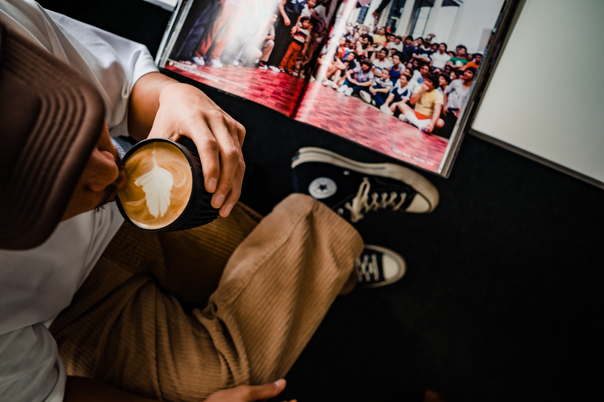
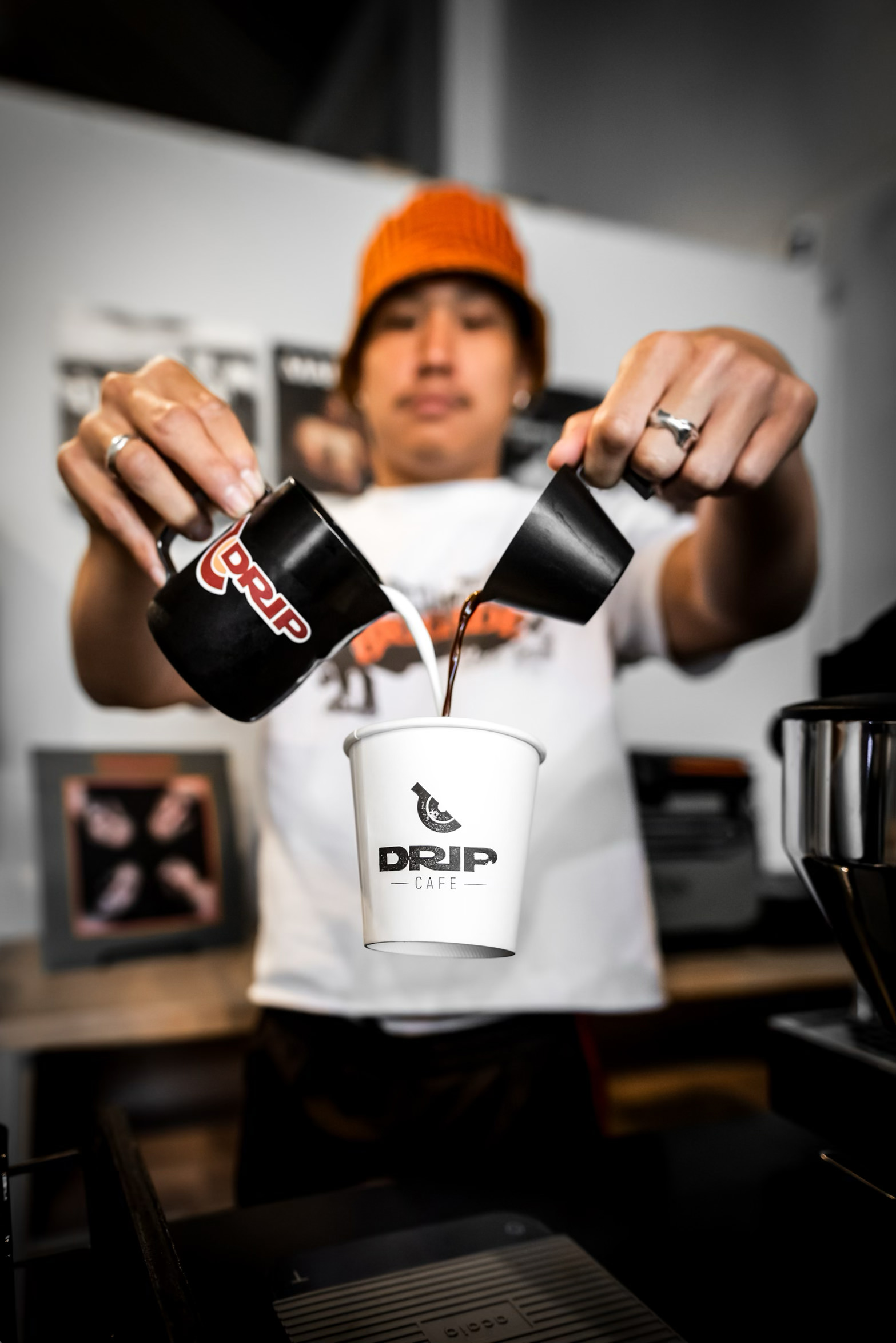
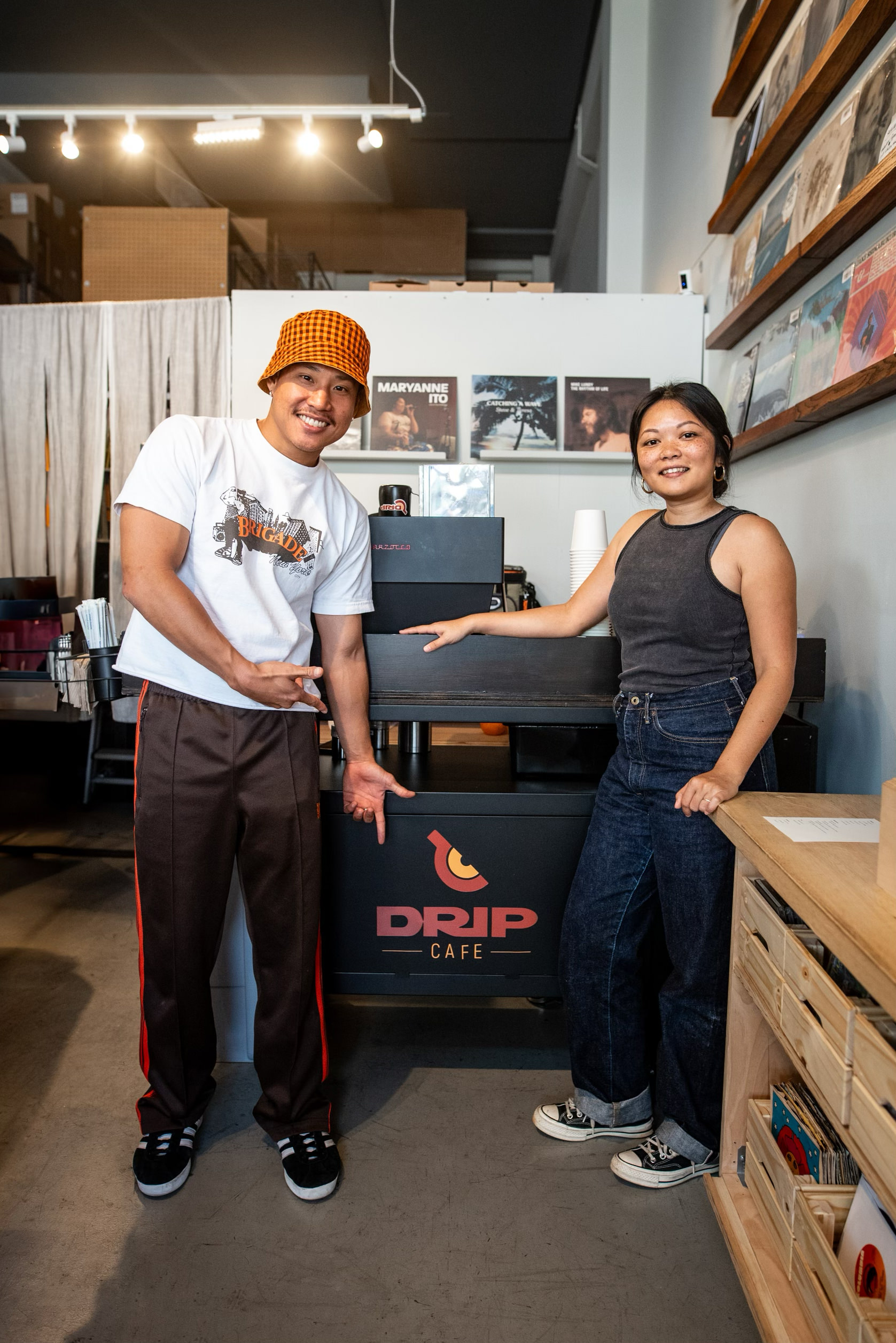
*Images 1 (header), 6 (levitating), and 8 (founders) by the amazing Adam Fujioka
Discovery Process
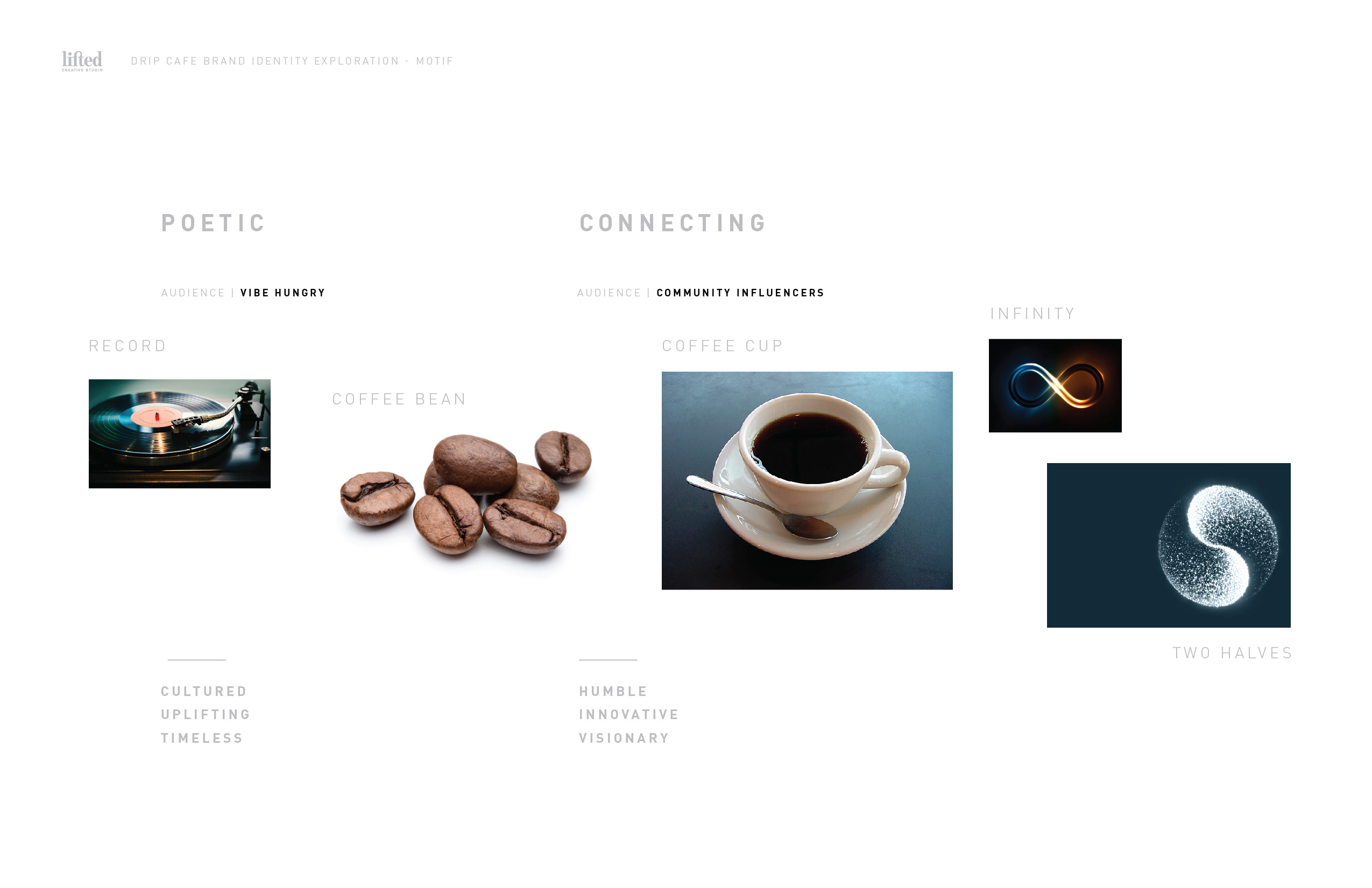
During the discovery phase, we identified the following Brand Attributes:
- Poetic: Embracing individuality and a deeper connection through the art of coffee.
- Connected: Fostering community and celebration of others.
- Timeless: Creating a sense of nostalgia with a modern twist.
Design Concept
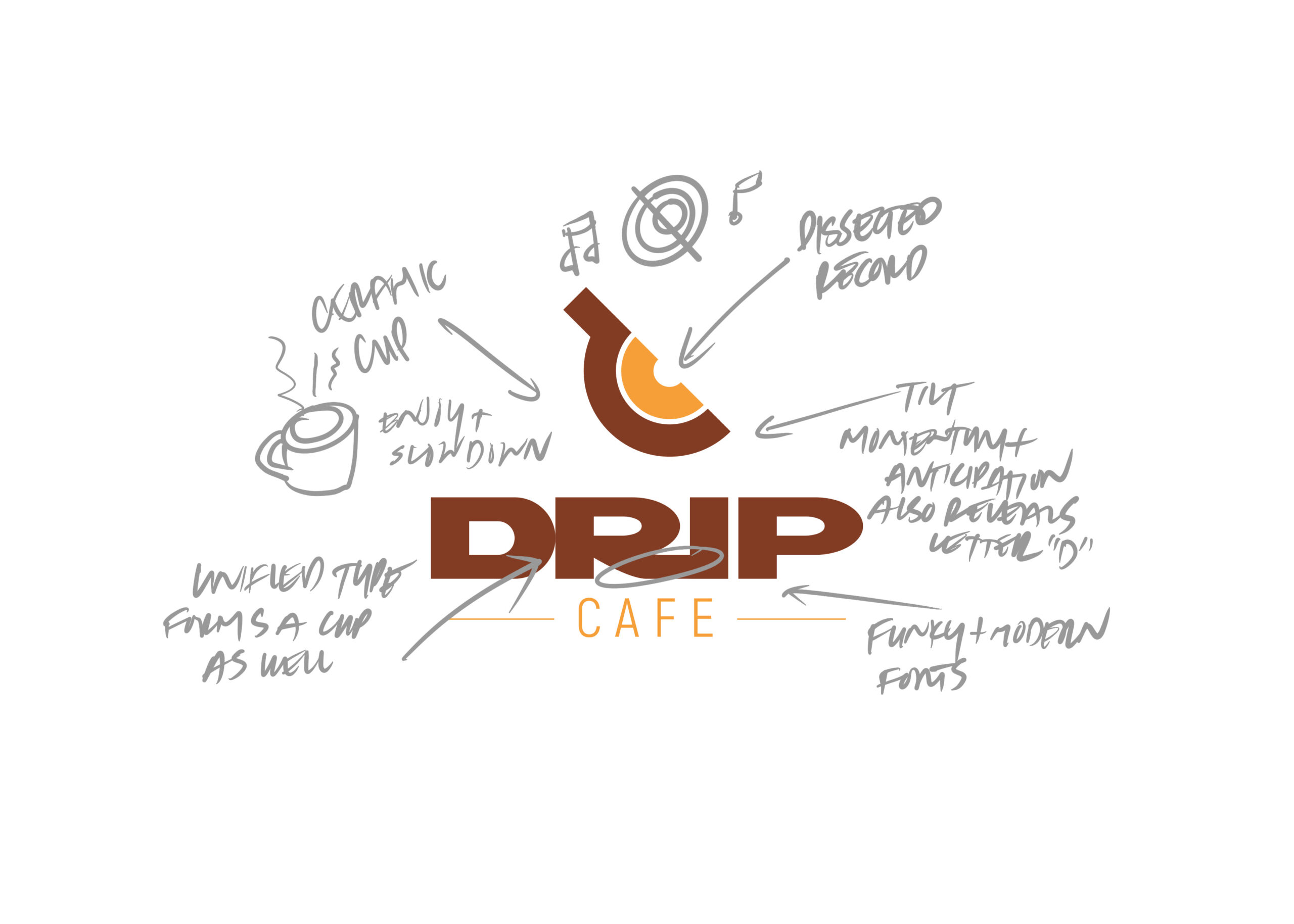
Among various mark studies, the combination of a record and a ceramic coffee cup stood out as the most representative of Drip Cafe’s brand essence.
- Record: Symbolizes the connection to music and soul in a retro way, evoking the nostalgia of crate diving and the pursuit of something special and meaningful.
- Ceramic Coffee Cup: Represents the necessary pause to sit and enjoy a cup of coffee, invoking community and connection around a shared table. The slight tilt of the cup on the record symbolizes the anticipation of the coffee drip and subtly reveals the letter “d.”
Color Palette
The color palette chosen for Drip Cafe celebrates the soul and substance of music, blending nostalgia with modernity. The main colors include:
- D’Angelo Brown: Rich, deep brown representing the warmth and earthiness of coffee.
- Sweet Mocha: A lighter, inviting shade of brown that adds warmth and comfort.
- Erykah Badu Blue: A moody blue that brings depth and a sense of calm.
- Turmeric Gold: A bright, vibrant gold that adds a touch of modernity and celebration.
- Light Gray: A neutral shade that balances and supports the primary colors.
Implementation
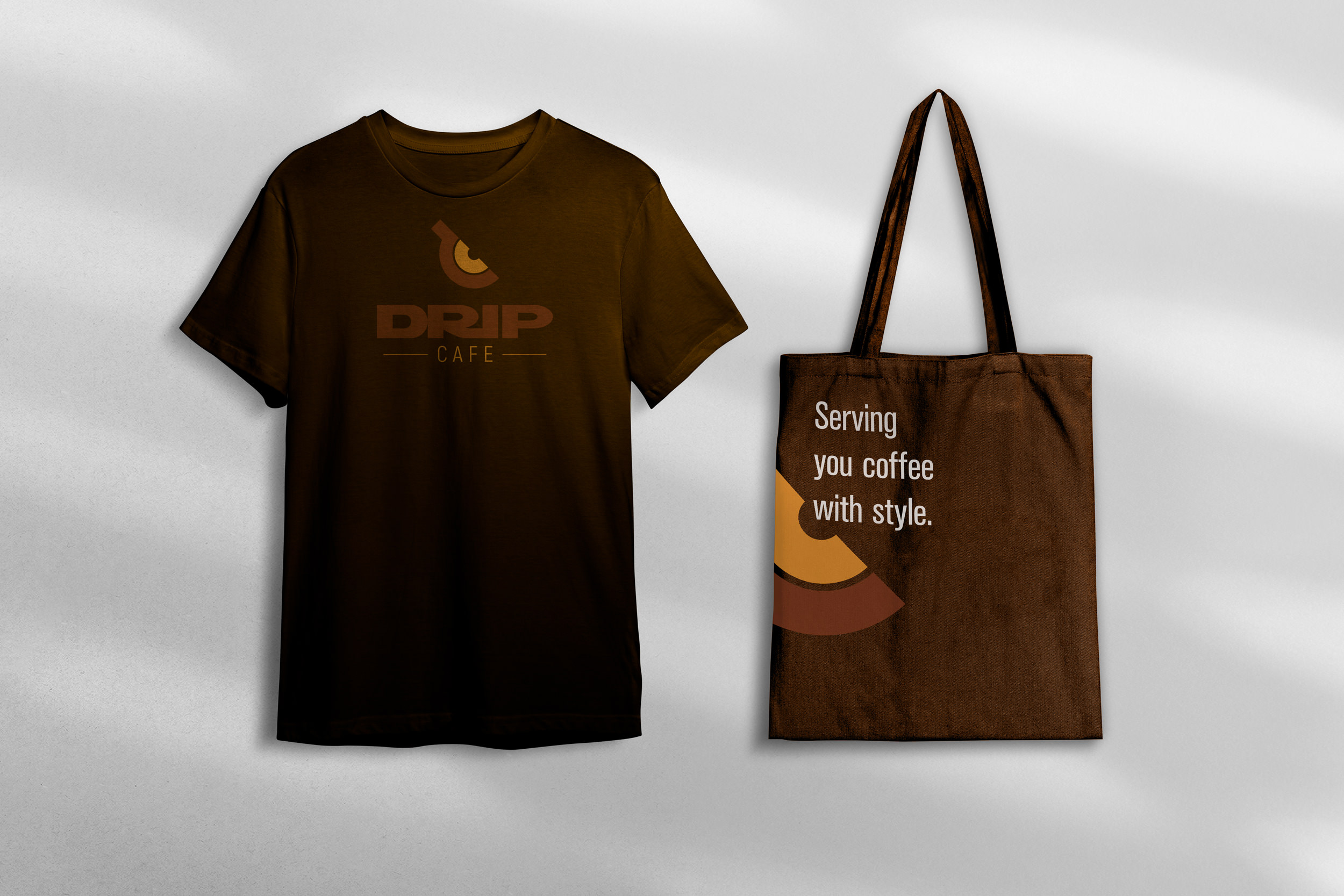
The new brand identity was rolled out across various touchpoints, including:
- Mobile Cart Design: Incorporating the new visual identity on the cart, signage, and promotional materials used at events.
- Packaging: Designing coffee cups, sleeves, and bags that reflect the new brand identity.
- Digital Presence: Updating social media profiles, website elements, and online marketing materials to align with the new brand.
- Photography: Capturing high-quality, branded photos that highlight the essence and aesthetic of Drip Cafe, used across marketing materials and digital platforms.
Outcome
The new brand identity for Drip Cafe has been well received by their audience, creating a strong and memorable visual presence. The combination of the record and ceramic coffee cup not only connects with their customers on an emotional level but also sets Drip Cafe apart in the competitive coffee market of Hawaii.
With the foundation of a strong brand identity, Drip Cafe is poised to expand into a brick-and-mortar location, continuing to connect people and celebrate others one cup at a time. The timeless and connected visual identity will support this growth, ensuring that Drip Cafe remains a beloved and influential part of Hawaii’s coffee culture.
Testimonial
“It was eye opening to go through the process of finding ourselves and how we want our business to be seen. We got to figure out more than just the look of our brand. We got to create a feel and figure out who we’d like to attract. Really enjoyed the process of getting to the final product and seeing the different formats along with examples of how our brand can be displayed. We believe if we didn’t go through that process we wouldn’t have been as satisfied with the outcome along with discovering more about ourselves and what we want in our brand.”
Jamie Ishii | Co-Founder